Intelligent Dating
Reduce swipe fatigue and boost authentic profiles with a guided dual‑profile flow

Project description
Our client, aimed to disrupt the dating app space by creating a dating app that was centered around authenticity and its unique dual profile system.
Background
Unlatched was created from a simple desire: create a dating experience that felt emotionally salient, authentic, and fun. After some research, we noticed that users felt emotionally burnt out using dating apps and many wanted a different experience from what was already out there.
So the question became, how can we create an app that felt different enough from what is out there and provided the user with a fun experience that they felt motivated to use?
Working in a team of two, we acted as both the UI/UX designer and UX researcher, and led every phase of the project.
Timeline
From explorations to final designs in 5 weeks while working with multiple projects at the same time
Tools Used
Figma, Figjam, Google Docs, Google Stitch, Otter AI
Problem
Through research, we found that the dating app experience often feels siloed — users are encouraged to present only a polished, idealized version of themselves. This lack of authenticity, combined with an overwhelming and step-heavy profile creation process, made many users feel disconnected and fatigued.
POV
I approached this project as someone overwhelmed by the dating app experience and often struggles to be authentic. I wanted to design an experience that felt playful, supportive, and community-driven.
Process
This category details the step-by-step approach taken during the project, including research, planning, design, development, testing, and optimization phases.
Research & Planning
Conducted market research & user interviews to identify existing dating app challenges and user preferences.
Define & Design
Synthesized the research and began defining the problems that the interviews and research presented. Defined user persona, outlined key features based on user needs and market trends, and created user and task flows. I also created an organizational sitemap to see how a user would interact with Unlatched's website.
Ideation & Implementation
With all of the knowledge, I iterated and built the visual design and brand. I built the logo, component library, and started building & testing low-fidelity wireframes.
Testing & Optimization
Conducted rigorous user testing across various devices and platforms to ensure compatibility and performance. Had the user go through the profile flow, and share feedback. Gathered user feedback and iteratively optimized the app based on usability testing, metrics, and user satisfaction.
Research & Planning
Since we were focused on creating a dual profile dating app, we want to understand what some of the biggest pain points were for users. So I focused on three key questions:
(1) What do users usually focus on when they create their dating profiles?
(2) Do they feel like their profile reflects the real them? Why or why not?
(3) What would an authentic dating app experience actually look like?
Methodology
We conducted five one-on-one interviews with participants who were interested in the dual-profile system.Across all five participants, there was strong interest in the concept of a dual-profile system, with most users finding it fresh, emotionally intelligent, and more human than existing apps. While reactions to how and when each profile side should be revealed varied, nearly all users valued the opportunity to be more real and felt the concept could reduce surface-level swiping. However, emotional safety was a recurring concern, especially around dishonesty, oversharing, and being vulnerable too soon. While some feared the extra effort required to build two profiles, most agreed it would be worth it if it led to more honest, meaningful connections.
Key Insights from
User Research
High Dating App Fatigue
Users avoided dating app because it felt too gamified or felt like they were swiping into a void and unable to build genuine connections.
Desire for Authenticity
Users felt a strain from using dating apps as they felt like they couldn’t be themselves and the burden of faking it deterred them from using the apps.
Need for Personality
Users wanted more breadth in what they could show. The dual profile allowed them to showcase differet sides of themselves, which they were all excited about trying.
Competitive Analysis
Did a competitive analysis on major players in this space to learn more about their strengths, weaknesses, opportunities, and threats.
In my research, I found that many users felt stuck in endless swipe cycles, unsure of others’ intentions, and often left the app feeling fatigued rather than excited. These insights helped me define the key problems to address: swipe fatigue, lack of transparency, and the need for more intentional, trust-driven interactions.
Define & Design
From my user interviews, three key themes emerged around motivations. Users wanted to connect with other users who were emotionally intelligent, foster genuine connections with others, and wanted to create environments of trustworthiness. The current dating environment made most of the participants feel burnt out, lost, or overwhelmed.
Problem Statement:
How might we build a dating app that not only engaging to the user, but also, provide direction so that there is low friction and users can create a profile they like and are proud of?
Once I had the problem clearly outlined, I moved into ideation. This phase was about exploring ways to reframe the dating app experience — thinking through features that could slow the process down in the right ways, encourage authenticity, and give users more control over how they connect.
To better organize user insights into actionable structure and insight, we created user personas and affinity maps to help us better understand the user's preferences and make sense and discern patterns. After some early level testing, we then built our our feature roadmap with the features that we saw the users valued the most. We then built a series of user and task flows that mapped out the onboarding and profile creation process as we saw that this was the use case that would be the most valuable for this project with all of our user feedback, and finally we thought about how the information would map with each other in an organizational sitemap. All of these processes helped us define our problem, and design accordingly, which informed our wireframing, prototyping, and testing.
User Persona
We created one final persona by the end of our research. We designed with the user in mind and the final persona we created was a millennial who had some level of self awareness and emotional intelligence. This user wanted simple, clear guidance and transparency to create a genuine emotional connection with other people and craved authenticity. This authenticity became our main driver in our design decisions.
Affinity Map
To bridge the gap between research and design, I used an affinity map to group interview insights into nine key areas:
General concept reactions
Profile creation struggles
Current app frustrations
Safety & trust concerns
Emotional safety & vulnerability
Visual authenticity & first impressions
Desired features & improvements
Matching logic & emotional compatibility
Reveal flow preferences.
This process helped me identify what mattered most: emotional safety & authenticity, safety & trust within the app itself, profile help & guidelines, visual support & clarity, personalized, judgment-free experience, community
Features
These themes became the backbone of Unlatched’s features, ensuring that every design decision addressed real user needs without adding stress or complexity.
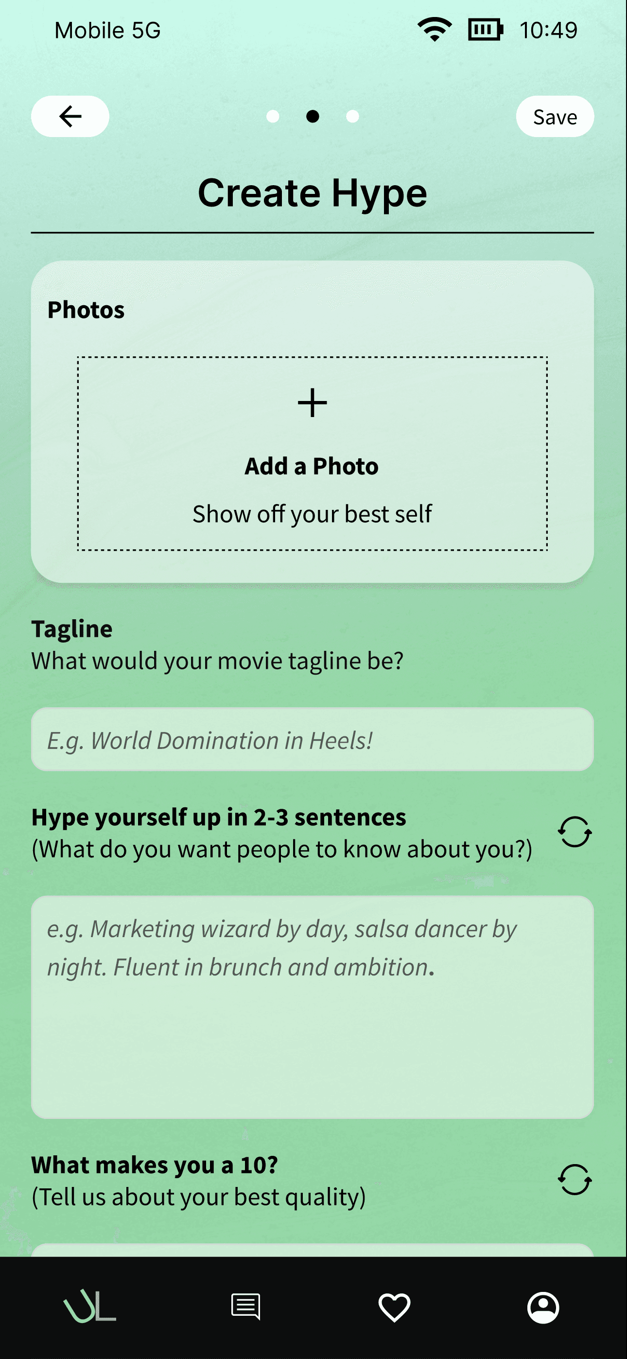
One of the main drivers of our app is the dual profile. The two profiles that we used our research to inform showcase two different sides of the user. The hype side is the polished side that most dating apps have currently. The unhinged side is the authentic side of the user and is the side that we identified would be the differentiating point for our app. This was the biggest feature that we focused on. We also saw that profile creation was a hassle and a big burden for users, so we focused on building out app prompts and guidelines so that if the user felt awkward to start or felt the pressure, there was something to help them not turn away from making their profiles. We also added a profile preview section into our design so that the user would see what the two profiles would look like prior to submitting so they had an idea of what their profile looks like, and gave them the option to edit prior to submitting.
User Flows
I then created a user flow to visualize how a user might navigate Unlatched’s core experience. The flow explored the profile creation experience for the dual profiles.
After iterating and working with the founder many times, we decided on the user and task flows together. We knew that the profile creation process was going to be challenging, especially for a dual profile system. So we had to focus on making the onboarding and profile creation screens as simple as possible. The process went through many different iterations before we decided on our design flow.
Sitemap
In terms of information architecture, we knew that we needed to create something simple. Since most of our design was in the mobile app, we knew that we eventually had to translate this experience into what it would feel like on the web experience. This sitemap showcases at a high level what we envisioned would be one of the core experiences for a user once they landed on our homepage.
Once the organization and flows were created, we moved onto branding so that we could shape the user flows, features, and sitemap into designs and prototypes. I focused on designing interactions that felt lighter and more intentional, like conversation prompts and transparency cues, while reducing the reliance on endless swiping. This project showed me how important it is to design not just for efficiency, but for emotional outcomes — making sure users walk away feeling connected, not drained.
Ideation & Implementation
After our research and defining stage, we felt confident to start designing the brand. We had to think on what would a user want from ad dating app that would encapsulate authenticity as its main theme.
After we did user testing, we saw that we initially had too many screens and this was too burdensome for the user so we had to change the UI and focus on creating a more seamless and less overwhelming experience.
After some more iteration, we came up with the branding that you see below. The branding is bright warmth, playful energy, and inviting freshness. Rounded typography and friendly illustrations create a fun and approachable vibe. The combination of vibrant hues, gradiation, and soft shapes reflects Unlatched’s goal to make dating feel fun, creative, and stress-free. It sets a tone that is energetic and welcoming without being overwhelming, inviting users to join without pressure.
Branding
Unlatched’s UI kit blends playful elements with a warm, inviting aesthetic. The logo features a simple circular logo icon, connecting to the authentic playful theme we wanted to embody for this app.
Buttons are pill-shaped, icons are punchy, and the smooth purple, green, and red gradients evoke energy and appetite while remaining approachable. The green and red were utilized to showcase the dichotomy between the two profiles, and the purple was used to give a sense of calm and was the general color for the rest of the app.
Typography uses Source Sans pro, a rounded and friendly font that complements the pill-shaped buttons and soft visual style, reinforcing the app’s welcoming and easygoing personality. We also felt that it was a font that was clean and very easy to read without any visual strain.
Low Fidelity Wire Frames
The low-fidelity wireframes focus on Unlatched’s core flow, highlighting the profile creation process from start to end. We wanted to gain an understanding of what we could have created with as little steps as we possibly could. This simple layout emphasizes easy access and clear organization without overwhelming the user.
We created many different versions of our design as we moved into mid fidelity. We provided the client with the general colors, look, and feel of the project so that we could start working on testing our results.
unlatched ui kit
This is the design system I used that incorporated elements for the UI & component library

After completing the low-fidelity wireframes, we conducted initial user testing to validate the basic layout, navigation, and overall experience of creating both the Hype and Unhinged profiles in the Unlatched dating app.
We then moved on to usability testing and each participant walked through the prototype, completed the profile flow, and shared feedback. Most participants found the process intuitive and enjoyable, with standout praise for the creativity and emotional depth of the questions. The dual-profile concept was seen as fresh and thought-provoking, and features like audio uploads, memes, and “Overshare” prompts helped users reflect more deeply on how they present themselves.
Participants appreciated the opportunity to express both polished and unfiltered sides of their personality. The overall sentiment was positive, with suggestions focused on adding flexibility, more guidance for indecisive users, and thoughtful customization. Most users said they would feel comfortable sharing both profiles publicly, and all expressed interest in seeing how this experience could evolve.
Usability testing on the high-fidelity prototype revealed areas for improvement such as shortening steps into no more than 3 screens, button prominence, color contrast for readability, and clearer progress indicators during recipe steps. Based on this feedback, I refined spacing, adjusted color balances, and enhanced micro-interactions for smoother, more intuitive user flow.
Solution
What emerged from all the work was a playful, mobile-first dating app designed for users who want to have a chance to show their authentic side and really connect with others.
What separates this application from others is its unique dual-profile system. This system prompts users to fill out two profiles in as little steps as possible, allowing users to have more range and flexibility to showcase who they really are. These profiles guide users with step-by-step prompts and guidelines.
The UX is designed to feel welcoming, creative, and joyful, turning dating into something fun, not frustrating.
How Might We (HMW):
How might we create a dating application that is fun for the user without overwhelming them?
Prototype
The final prototype delivered a calming, contemporary, and playful experience that supported users with intuitive steps, and easy to view profiles, helping users feel enthusiastic to use a dating app that is different from what they have used in the past.


Reflection
Challenges Faced
I would say the biggest challenges that we faced were time constraints and ambiguity with the direction to take our design and the project. Four weeks was a very intensive time period to build an app from 0 to 1 and honestly felt a bit too constraining. We couldn’t spend more time doing things like research and iteration because we had a deadline to hit. Also, once we got feedback, figuring out how to take the decisions of the users we interviewed as well as the owner made it difficult to find a fine balance. We had to design with both in mind while making sure that our design made sense and was feasible.
Learnings
I learned a lot through this process. I learned how to work closely with a small team of designers. I learned how to build something while resources and time was lean. I also learned a lot about designing in this process. I improved designing components and repeatability in figma. I also learned about different design principles and systems and now I feel like I can design much better or have a more in depth understanding on how to build faster in figma for future projects.
Next Steps
I would focus on building out more of the features for the project. I think a lot of the design past the profile creation still needs to be worked out. The interaction with the home screen, the bottom nav, the features in the nav, security, authentication, etc. There is a lot of work to be done so I think focusing on building out some features would be a fun next step.