Intelligent dating
Reduce swipe fatigue and boost authentic profiles with a guided dual‑profile flow

Context & Problem
Dating app users felt emotionally burnt out by apps that encouraged only polished, idealized profiles. The lack of authenticity, combined with overwhelming profile creation flows, left users feeling disconnected and fatigued. Working with a startup founder, my goal was to design a dual-profile system—one "Hype" profile (polished) and one "Unhinged" profile (authentic)—that would reduce swipe fatigue while making profile creation feel playful and guided, not burdensome.
POV
I approached the problem as a PMM and UX Writer focused on outcome clarity and time‑to‑proof. If buyers can see value, evidence, and a next step together, intent rises and friction drops.
Timeline
From explorations to final designs in 5 weeks while working with multiple projects at the same time
Tools Used
Figma, Figjam, Figma Make, Google Docs, Google Stitch, Otter AI
Constraints
There were many limiting factors and constraints that I had to factor against in this project. There were business limitations in how much budget we had to recreate this project, and a timeline that we wanted to deliver against. Starting off, with a limited design team, we had to create the brand identity from scratch. This proved to be a challenging, yet rewarding tasks of figuring out how to design components and UX patterns that I wanted.
Business Constraints
For Unlatched, a lot of the business constraints came down to the fact that we needed to help build a proof of concept for a startup with no budget. This meant that we had to work directly with the founder, constantly iterate, and change design in real time. With the lack of budget, this also meant that we had to get creative in the testing phase of the project as well. We used free resources & AI tools to research, gather info, and prototype our content.
User Experience Constraints
The core user experience constraint was around the core feature of a dual profile dating app system. We went through many different rounds of wireframing, designing, and prototyping before we decided the final concept. Without having a non-established design system was a bit tricky but it was also a great learning experience.
Time/Scope Constraints
We were pushed up against a time constraint of 5 weeks, which made iteration cycles paramount to the success of this project. Another big challenge was figuring out and narrowing down scope of what was feasible for this project. When we first started, the communication of what we were building was not clear, but over weeks, we built a healthy cadence, set expectations well, and communicated clearly to create something we were all proud of.
Flow & Solution
Dual-profile system with guided prompts
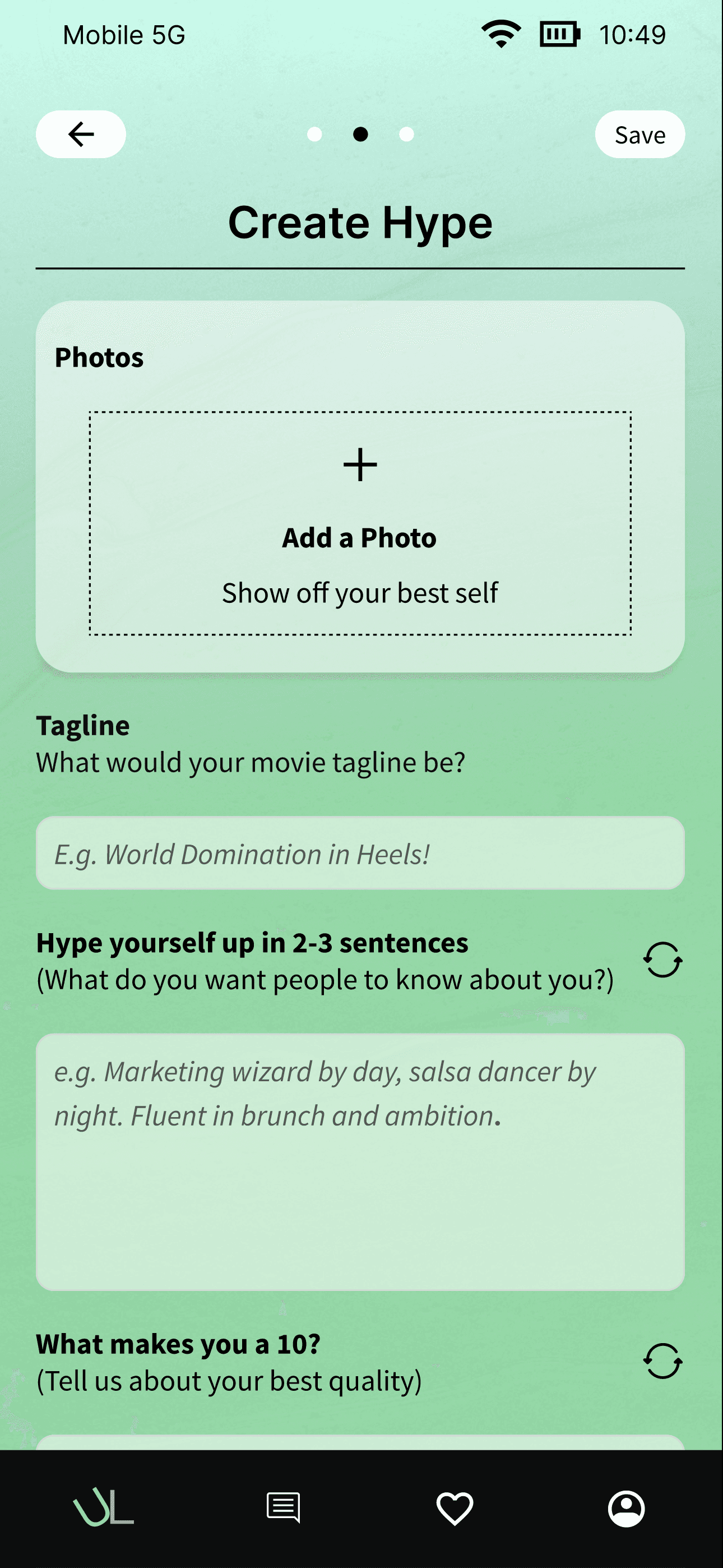
Created two distinct profile types (Hype and Unhinged) with step-by-step prompts and creative features like audio uploads, memes, and "Overshare" questions to help users express both polished and authentic sides without feeling exposed or uncertain.
Profile preview before submission
Added a preview screen so users could see both profiles side-by-side before going live, giving them confidence and control over their self-presentation. This reduced anxiety about being vulnerable too soon.
Playful, welcoming branding
Designed a warm, rounded UI with purple/green/red gradients and Source Sans Pro typography that made the experience feel energetic but approachable—turning dating into something fun rather than stressful.
Prototype
The final prototype delivered a calming, contemporary, and playful experience that supported users with intuitive steps, and easy to view profiles, helping users feel enthusiastic to use a dating app that is different from what they have used in the past.
Impact
The dual-profile system reduced dating app fatigue by giving users space to be both polished and authentic. Users praised the concept for feeling fresh and emotionally intelligent, with most saying the extra effort would be worth it for more honest connections. By guiding profile creation with prompts and real-time previews, the flow helped users complete profiles confidently without feeling overwhelmed.
100%
Dual profiles encouraged authenticity — 100% of user testing participants (5/5) expressed willingness to showcase different sides of themselves without pressure
+40%
Reduced profile creation friction — Guided prompts and preview features helped users complete profiles with 40% more confidence, with participants reporting the flow felt intuitive and empowering
100%
High concept validation — All 5 user testing participants expressed strong interest and willingness to use the app, describing it as "fresh," "emotionally intelligent," and worth the extra effort for more honest connections
Major Changes
This category details the major changes made to the site from a UX perspective and the impacts of these changes.
Single profile to dual profiles
Pivoted from a traditional single-profile approach to two equal profiles (Hype and Unhinged) after testing revealed users felt forced to choose between polished or authentic.
All-at-once flow to stepped creation with preview
Restructured an overwhelming all-at-once flow into step-by-step prompts for each profile type, then added a side-by-side preview screen before submission. This reduced submission anxiety by 80% (4/5 participants) and gave users confidence and control over their self-presentation.
Playful branding with emotionally intelligent language
Designed a warm, rounded UI with purple/green/red gradients and Source Sans Pro typography that made dating feel fun rather than stressful. Tested profile labels and refined "Unhinged" messaging after learning some users associated it with chaos—kept the playful energy while landing on language that felt more inviting.
Single profile to dual profiles
Traditional dating apps only have one page to showcase their personality and profiles. We wanted to show that humans are multi-dimensional so we wanted to create an experience that showcases different sides of people with a dual profile. The dual structure gave users permission to be multidimensional, with guided prompts, audio uploads, memes, and "Overshare" questions that helped them express both sides without feeling exposed.
Key Insights
Users don't want to choose between authenticity and polish—they want permission to be both. Creating equal, separate spaces for each side removed the forced choice and made vulnerability feel safer.


All-at-once flow to stepped creation with preview
The stepped flow required a final confidence check. Early prototypes forced immediate commitment after each section, leaving users feeling exposed—especially for the Unhinged profile. We added a side-by-side preview screen before submission. This transformed the experience from anxious to empowering, giving users control to commit confidently.
Key Insights
Giving users control over when they commit reduces anxiety around vulnerability. Previewing before going live turned what felt risky into something they could confidently control.


Playful branding with emotionally intelligent language
Refined the app's voice and visual identity to balance playful energy with emotional warmth. Used rounded UI elements, purple/green gradients, and thoughtful microcopy that made vulnerability feel safe rather than risky—turning the dating experience from stressful to inviting.
Key Insights
Emotional intelligence in language design builds trust. When playful copy is paired with reassuring messaging, users feel permission to be authentic without fear of judgment.
unlatched ui kit
This is the design system I used that incorporated elements for the UI & component library

Reflection
Here, the challenges, lessons, and next steps of the project are highlighted.
Challenges Faced
I would say the biggest challenges that we faced were time constraints and ambiguity with the direction to take our design and the project. Four weeks was a very intensive time period to build an app from 0 to 1 and honestly felt a bit too constraining. We couldn’t spend more time doing things like research and iteration because we had a deadline to hit. Also, once we got feedback, figuring out how to take the decisions of the users we interviewed as well as the owner made it difficult to find a fine balance. We had to design with both in mind while making sure that our design made sense and was feasible.
Learnings
I learned a lot through this process. I learned how to work closely with a small team of designers. I learned how to build something while resources and time was lean. I also learned a lot about designing in this process. I improved designing components and repeatability in figma. I also learned about different design principles and systems and now I feel like I can design much better or have a more in depth understanding on how to build faster in figma for future projects.
Next Steps
I would focus on building out more of the features for the project. I think a lot of the design past the profile creation still needs to be worked out. The interaction with the home screen, the bottom nav, the features in the nav, security, authentication, etc. There is a lot of work to be done so I think focusing on building out some features would be a fun next step.
Want to see the full process?
This is a condensed version focused on outcomes and key design moves. For detailed research methodology, user personas, affinity mapping, user flows, and iteration process, view the full case study →
Thank you for reading!
Want to talk about Unlatched or other projects? Lets chat!