What conditions let authentic connection happen instead of performance?
COMPANY
Unlatched
ROLE
UX Researcher/Product Designer/UX Writer
Main ProblemS
Brand Design/Brand Identity
YEAR
2025
+40%
PROFILE COMPLETION CONFIDENCE
80%
DUAL PROFILE COMPLETION
+50%
ONBOARDING COMPLETION
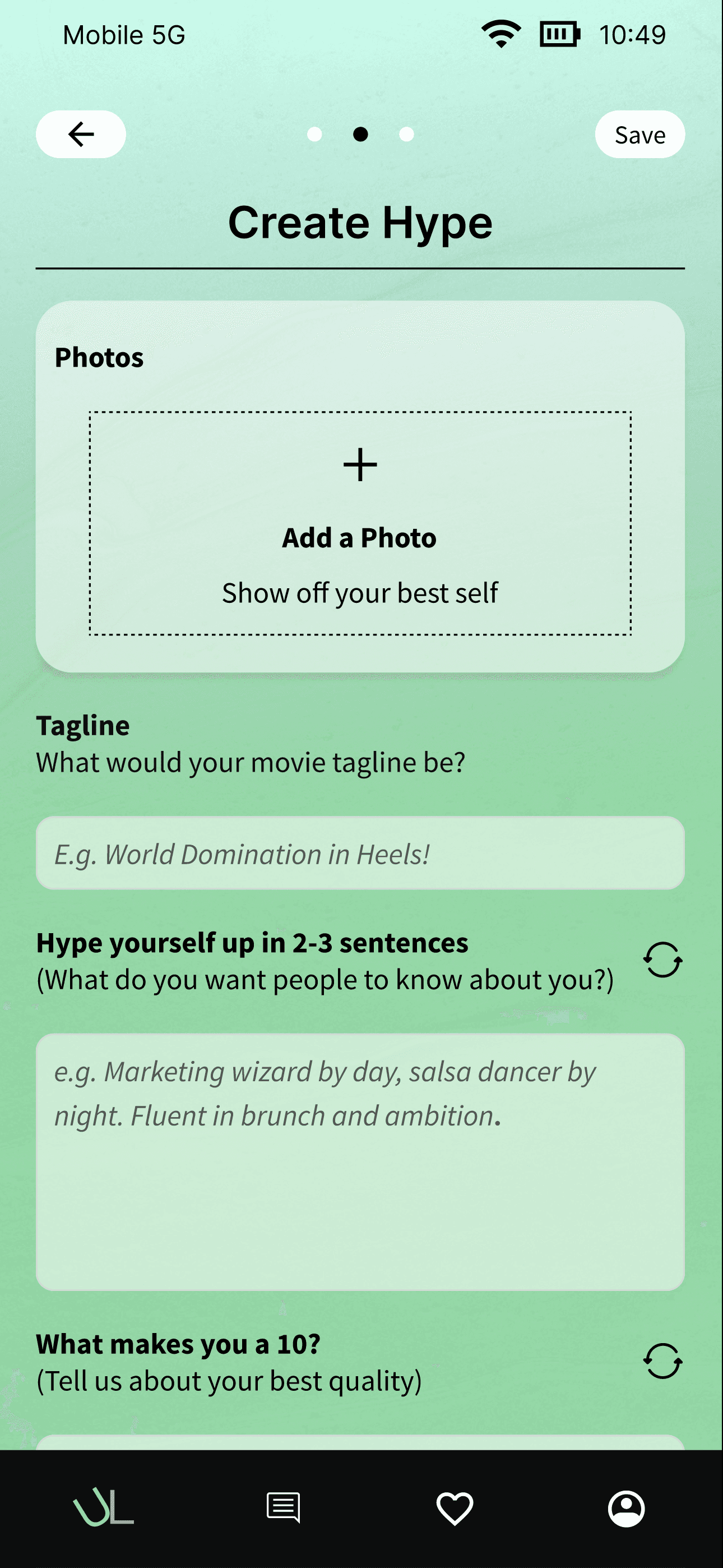
The Problem
Dating apps had trained people to perform. The result was swipe fatigue — not from too many options, but from too little honesty.
Users felt emotionally burnt out by apps that rewarded polish and penalized vulnerability. The profile creation flow forced an impossible choice: be authentic and risk rejection, or be curated and attract the wrong people. Most chose the latter. The apps were optimized for engagement, not connection — and users could feel the difference.
Working with a startup founder, the brief was to design a dual-profile system, one Hype profile (polished) and one Unhinged profile (authentic), that would reduce swipe fatigue while making profile creation feel playful and guided rather than exposed and burdensome.

Starting from zero — no design system, no brand, 5 weeks to a working prototype
The Goals
Three constraints that shaped every decision.
WHO I WAS DESIGNING FOR
Someone who's been on dating apps long enough to know what's wrong with them.
The research surfaced a consistent emotional profile, not just a demographic one. These were users who understood the game the apps were playing and were tired of playing it. They didn't want a better algorithm. They wanted a different set of conditions entirely.

WHAT I NOTICED
People didn't want to choose between authenticity and polish.
They wanted permission to be both.
Research surfaced a consistent pattern: the problem wasn't that people were dishonest — it was that the design of existing apps made honesty feel risky. One profile for everything forced users to optimize for the most defensible version of themselves rather than the most real one.
When you force people to choose between their polished self and their real self, they'll choose polished every time — and then feel hollow about it.
The second thing that surfaced was submission anxiety. Early prototypes that forced commitment after each section left users feeling exposed, especially on the Unhinged profile.
Vulnerability needs scaffolding. People don't drop their guard in one step. They need to see the full picture before they commit to it being seen.
KEY INSIGHT
Authenticity isn't a design feature you add. It's a condition you create by removing the structures that make honesty feel dangerous.
The Structural Shift
The reframe: don't ask people to be authentic. Design the conditions where authenticity becomes the easier choice.
Two equal, separate spaces - Hype and Unhinged - removed the forced choice entirely. Each profile had its own language, its own prompts, its own identity. Users weren't being asked to be two people. They were being given room to be one person fully.
Guided prompts: audio uploads, memes, "Overshare" questions, gave the Unhinged profile structure without formality. The prompts didn't ask users to perform vulnerability; they created moments where vulnerability became natural.
The side-by-side preview screen before submission was the hinge point. Seeing both profiles together, before anyone else could see them, transformed the emotional register from anxious to empowering. Control over when you commit changes how you feel about committing.
THE FINAL PROTOTYPE

CONDITIONS REDESIGNED
Single profile → dual profile system.
Pivoted from a traditional single-profile approach after testing revealed users felt forced to choose. Two equal profiles gave permission to be multidimensional — Hype for the polished version, Unhinged for the real one.
KEY IMPACT
→ +50% improvement in onboarding completion compared to early testing.
THE ONBOARDING FLOW
Simplistic Onboarding
Onboarding screen is inviting, simplistic UI sets the expectation for the dual profile experience


Hype Profile
Profile screen showing the polished version of a user. A chance to hype yourself up and show your confidence
Unhinged Profile
Profile screen showcasing the authentic, more raw version of the user. This side is unapologetically you

ONBOARDING OPTIONALITY
Giving users control over when they commit reduces anxiety around vulnerability. Previewing before going live turned what felt risky into something they could confidently control.
All-at-once flow → stepped creation with preview.
Restructured an overwhelming single flow into step-by-step prompts for each profile type. A side-by-side preview screen before submission reduced submission anxiety and gave users control over self-presentation before going live.
KEY IMPACT
→ 80% dual profile completion 4 of 5 testing participants completed both the Hype and Unhinged profiles in full
Hype Profile
Profile screen showing the polished version of a user. Toggle makes it easy to switch between two profiles.

Unhinged Profile
Profile screen showcasing the authentic, more raw version of the user. Toggle makes it easy to switch between two profiles.

CONTROL STAYS WITH THE USER
Giving users control over when they commit reduces anxiety around vulnerability. Previewing before going live turned what felt risky into something they could confidently control.
Brand built from 0 to 1
Designed the full UI system — warm, rounded components, purple/green gradients, emotionally intelligent microcopy. Iterated on profile language after early testing found some users associated "Unhinged" with chaos — refined toward playful warmth without losing the edge.
KEY IMPACT
→ +40% completion confidence Users reported 40% higher confidence completing vulnerable prompts with warmer design system.

unlatched ui kit
This is the design system I used that incorporated elements for the UI & component library
Created the brand from 0 to 1
Starting with a bare bone low fidelity wireframe, we created the complete design system driving the look and feel of the brand.
The Tradeoffs
Designing for authenticity meant making choices that added friction in service of something more important.
This project showcased that while there isn't a best answer on how to make a dating app, authenticity is become more and more important to the integrity of the dating app experience. This project allowed me to create designs within a set of unique design constraints, and was a good learning experience.
THe SYSTEM VIEW
The dual profile, the guided prompts, the preview screen — each one addressed a different fear.
Fear of being forced to choose. Fear of being seen before you're ready. Fear that the app would make you perform rather than connect. The design decisions weren't UX improvements stacked on top of each other. They were answers to emotional obstacles that appeared in sequence as users moved through the flow.
Building the design system from scratch in five weeks with no budget was the constraint that sharpened everything. Every component had to earn its place. Every iteration had to happen in real time with the founder. The scarcity of resources made the design cleaner. There was no room for anything that didn't directly serve the conditions the experience needed to create.
OUTCOME
WHAT THIS CONFIRMED
Vulnerability needs design scaffolding. You can't ask people to be real in environments that make honesty feel risky.
This was the most personal of the projects I've worked on. Designing the conditions for human connection is harder and more rewarding than any enterprise information architecture problem. The stakes are different when the thing you're designing affects how people feel about themselves.
The profile creation flow is strong, but the interaction layer past it, the home screen, the match experience, the conversation, is where the philosophy gets tested in the wild. The conditions we designed for profile creation need to carry through to how people encounter each other. That's the next design problem and the most important unresolved question this project left behind.